The world of education if getting more and more competitive–rising costs, fewer applicants. More than ever admissions offices are seeking innovative ways to reach their prospective students through social media, web, recruitment. It can be safely said that the school’s website is a primary resource for prospective students. So what is the role of print? Is there still a need to create something that gets handed or mailed out? Yes, but it has to move beyond a traditional bound publication packed with content. It has to be something that captures attention, tell a story, and entices someone to learn more.
When we started concepting the admissions materials for Cate School in Carpinteria, California we had three goals for the design:
- To create a piece that felt like a gift when it arrived in a recipient’s mailbox.
- To be something that captured the attention of both the parent and student and bring the family together to review and discuss the school.
- To capture the sense of place, “one of the most beautiful places in the world.”
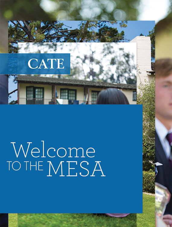
The final solution we created was a series of printed pieces that each have their own interactive experience. “People of the Mesa” profiles archetypes of the Cate community in series of cards that unfold accordion-style. While the student is unfolding the sorting the cards the parent can read “Life on the Mesa,” a 24-page booklet that delivers core messaging about the school’s academically rigorous curriculum. “Graduates of the Mesa” contains profiles of the class of 2013 all written by the school’s Headmaster Ben Williams on one-side and a fold-out map on the other revealing in one quick glance where the graduates go on to college. All three pieces are wrapped with a band that opens to show the school’s rich history. The complete package mails in a clear acetate envelope so recipients can get a glimpse at the contents—almost like peeking under the wrapping of a present.
Each piece tells a story in a visual, concise way. We worked with Cate School’s Sarah Kidwell, Director of Marketing and Communications, Charlotte Brownlee, Director of Admissions, and Ben Morris, Multimedia Coordinator to accurately represent the school’s mission and culture and capture day-in-the-life photography. Mark Sheehy Creative was called upon to write strategically crafted copy to capture the essence of Cate. It doesn’t get bogged down in details but instead pulls readers in—it entices people to learn more, to go to the website, and to finally set-up a visit to the school. Based on past numbers from Cate Office of Admissions once prospective families visit the school 97 percent apply. The goal of the printed material is to get people there—whether it is the website for more information or the school.
Leave a Reply