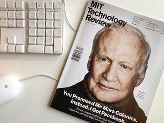
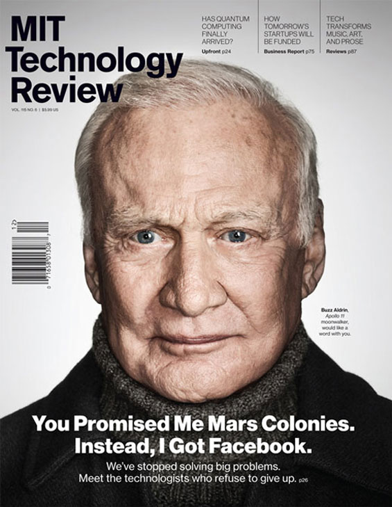
On November 6, the latest issue of MIT Technology Review hit the newsstands. The print edition is the last piece of a larger content delivery re-envisioning focused on a “digital first” model. It is a much different publication than the one I art-directed from my studio from 1998 to 2000. Here we discuss the new vision with creative director Eric Mongeon, who worked with me on the magazine from 1999 to 2000 and then went on to become the in-house art director and recently returned to be the creative director.
A few facts about MIT Technology Review:
The magazine has been published since 1899. The price is $24.95 for six print issues, with unlimited access to archives. It is free to alumni (approximately 140,000 people). All content is available free online, while the print edition is curated content from the previous six to eight weeks. It is also available on newsstands.
2Communique: You were the art director at Technology Review from 2000 to 2003 and returned in March 2012. How is your position as creative director different now?
Eric Mongeon: When I was the art director, my core responsibilities were the conceptualization, art direction, and design of the print magazine specifically. Like most publishing companies a decade ago, Technology Review was very print-focused; it was a typical ad-supported editorial operation that made content available for free online, and it would stage a big conference or event every year.
As the creative director of MIT Technology Review, I’m now responsible for setting the design strategy, vision, and direction for all print, digital, and event projects. Though our mission remains the same—to promote the understanding of the practical impact of new technologies—the means are quite different now. We’re a digitally oriented global media company that produces content online, in print, on mobile devices, and at conferences around the world. We publish in six languages in 147 countries and coordinate 400 live and webcast events each year. It’s a much more ambitious company than the one I left nine years ago, and Jason Pontin, the editor in chief and publisher, places a high priority on design that is consistent across all platforms.
2Communique: How does the magazine fit into the overall communication strategy for the company?
EM: Print is a platform we take seriously, but it’s one of several—and it’s by no means the most important one.
We continue to publish the print magazine for three primary reasons: 1) We know some people—myself included—find print the preeminently pleasurable medium. 2) Our owner, MIT, believes all alumni should get a print edition six times per year. 3) Visibility on the newsstand is desirable to many of our advertisers and serves as a key piece in our marketing strategy (i.e., raising awareness of and spurring interest in the brand).
2Communique: Many online versions of magazines are created from the content in the print edition, typically with Web add-ons. MIT Technology Review has taken a different approach, where the print is curated content from the Web. What is the process for selecting content for the print edition? How does “digital first” change how you approach art direction and design?
EM: It all happens simultaneously. Though the print magazine is published on a bimonthly schedule, we follow the production workflow of a weekly magazine. Each Friday, a batch of print layouts is due. The pieces are copyedited, fact-checked, and prepped for press as if we were shipping them. All of the copy is labeled with XML tags, and the images are resized according to our online specs. Our Web producer, Kyanna Sutton, assembles the Web pages with direction from the design staff and pushes everything live, and our production manager, Jim LaBelle, simply sits on the page files until we’re at the end of our eight-week editorial cycle, when the issue ships to press.
Because this all happens so quickly, we designers rarely conceptualize a story with a complete draft. Instead, the editors provide us with a very concise story brief, which allows us to devise a visual approach and identify appropriate illustrators, photographers, videographers, and/or animators to help us execute.
Of course, this sometimes means double the work: For the online version of a story, we’ll commission a videographer to produce a short film, and then we’ll send a still photographer a week later to create images for the print version. We’ve found that it’s nearly impossible to get quality video and quality still images at the same time.
2Communique: With a “digital first” model, how does a publication sustain the need for a print edition?
EM: It starts by acknowledging what print cannot do and emphasizing what it can do. Print can’t compete with digital media on timeliness. Neither can it be social or searchable. And it will never be less expensive (at least not for MIT Technology Review; the digital paywall was a failure for us).
Print can shine, however, if you approach the project as an artifact—a beautifully crafted, curated, collectible reading experience intended to be savored—rather than as mere ephemera that you read and then recycle.
2Communique: You had mentioned that there will not be a tablet version. With tablet publications being the trend, why has MIT Technology Review decided not to pursue one?
EM: Certainly apps allow for beautifully designed reading experiences on digital devices, but publishers who think they can make the economics work are delusional.
For starters, most tablets are Apple machines, and Apple shaves off 30 percent of the profit on all single-copy and subscription sales through the iTunes store. True, in June of 2011 Apple did allow publishers to begin selling through their own sites, but the mechanism will never be as smooth as that of the iTunes store—provided a prospective subscriber can even find it.
Second, it’s actually a lot of work to adapt print publications to apps. Many publishers end up producing up to six different versions of any given editorial product: There’s the core print piece, plus a digital replica for browsers and proprietary readers like Zinio, plus a digital rework for landscape viewing on tablets, plus a digital rework for portrait viewing on tablets, a kind of hack for smartphones, and then HTML pages for their websites. Even if you keep all the production in-house, there are labor and opportunity costs associated with the extended workflow. Also, iPad apps are written in Objective C, and since most Web developer departments have personnel who specialize in HTML, CSS, and Javascript, this usually means expensive, time-consuming outsourcing.
But the biggest problem with publishing apps isn’t technical. When people read news stories in digital media, they expect them to have the linky-ness of the Web. Stories in apps don’t really link; they’re beautiful “walled gardens.” And not even the most dazzlingly novel or elegant publishing app can overcome the frustration of reading digital media sequestered from other digital media.
We no longer support our iOS apps and have dumped the digital replicas. We’ve chosen instead to focus our digital strategy around a great site coded in HTML5, so that our Web pages will look beautiful on any screen.
2Communique: In 1997, when we worked on the magazine together, the design was heavily influenced by the impact of the Web (underlined headers, tabs). How did digital media influence the latest redesign?
EM: I look at those old issues and, though I’m quite proud of the art direction and visual storytelling, tend to cringe at the aesthetics. Their look—like the look of many technology publications today—was really only superficially informed by digital design.
When Nick Vokey, who is our new art director, and I approached this redesign, we were very deliberate in our effort to avoid aping the visual language of digital media. Instead, we tried for a design that embodies the ideals of technology—things like intelligence (is information smartly organized?), elegance (is it pleasant to look at?), utility (is it clear and easy to read?), and most important, pleasure in use (is it fun?).
The result is a print format that, though it bears a resemblance to the digital platform, has a distinct identity. And vice versa—the print and digital platforms are intended to be seen as siblings, not twins.
2Communique: What role did user experience play in the design of the publications?
EM: You taught me that the user’s experience of navigation, legibility, and narrative pacing are central concerns, so of course those were priorities when we tackled the print platform.
On the digital platforms, this is even more of a priority. Our development team consists of just five people, and one of them is a full-time user interface designer. Emily Dunkle spends her days obsessing over things like link hierarchies and hover states. And Brent Turner, our chief digital officer, is sort of the Billy Beane of Web dev; he’s constantly gathering usage statistics, gauging how readers are interacting with the site, and working with us designers to refine their experience.
In my view, UX is where the action is right now. This evolving specialty combines aesthetics, sociology, behavioral science, and philosophy, all with an eye toward crafting dramatic reading/viewing experiences. I expect the practice of graphic design—print and environmental, as well as digital—to become increasingly multidisciplinary in the coming years.
2Communique: Beyond the photography and illustration, the publication is devoid of color. What is your thinking behind this direction?
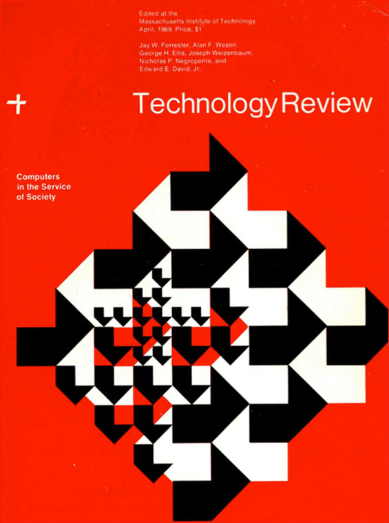
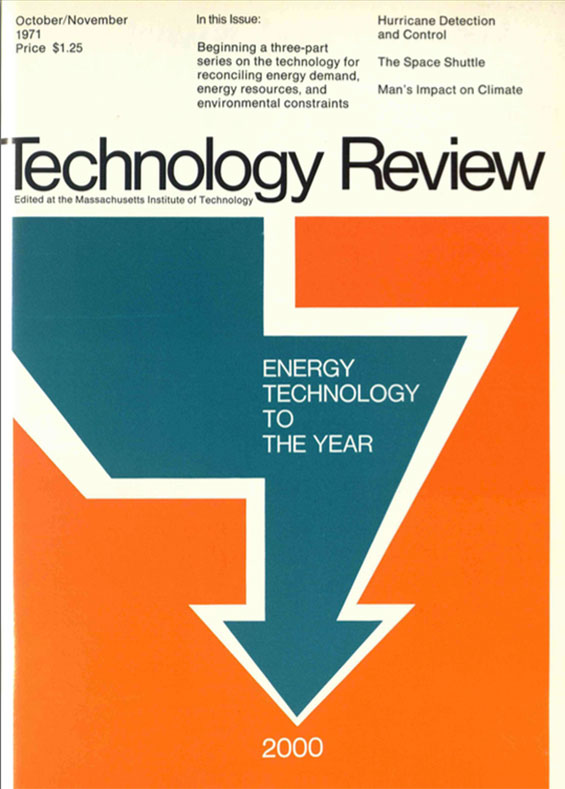
EM: We began the redesign process by looking at 113 years of Technology Review magazine archives, searching for inspiration and trying to uncover the core identity of the magazine. We were very taken with the work done under the guidance of Muriel Cooper, who ran the MIT Publications Office in the late 1960s and early 1970s. The magazine during that era featured full-color covers but had only two-color interiors. Those publications couldn’t rely on color to provide the drama—it was all done with the typography and a dynamic page grid. So we followed suit, stripping out the color from our layouts almost as a thought experiment.
We discovered that when you do this, the images—which do feature color—take on added significance within the layouts. They become like the paintings hanging on the walls of an art gallery.
This approach may prove restrictive in the long run, but we’re going to try it for a while.
2Communique: What qualities do you feel today’s designer needs to have to stay relevant?
EM: The same qualities they’ve always needed: curiosity, visual and cultural awareness, a respect for the history of the practice, and above all, an understanding of typography. Increasingly, businesses understand that design is more than mere gold-plating applied to interchangeable commodities; it’s a differentiator central to any modern business strategy. It’s up to us designers to demonstrate how.
2Communique: What are some things you want to explore in future issues?
EM: I’m looking forward to exploring data visualizations and information graphics. It’s hard to get them right—balancing the need to inform with the desire to delight, and without evoking the drudgery of homework.
We seem to be entering a sort of golden age of infographics design; we have access to an unprecedented amount of information, and there’s a new crop of professionals working today—people who came up after Edward Tufte—using digital tools to render it in ways that are relevant, useful, and beautiful. I want us to be part of that effort.
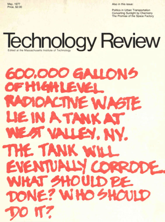
2Communique: What are your top-five favorite MIT Technology Review covers of all time?

Leave a Reply