One of the design aspects of magazines from the past that I miss is the minimal treatment of the cover. The work of George Lois for Esquire is a clear example. The covers communicated a clear message with a well-directed photo or illustration and minimal type, if any. That is certainly not the case with newsstand magazines today. This trend even shows up in the custom magazine world where membership magazines and journals feel the need to compete for the readers attention by plastering lines and lines of type over the cover image. And don’t forget the logo from some award or seal of approval.
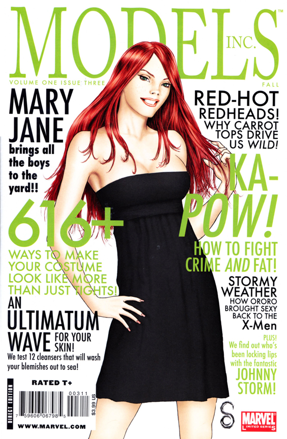
This has become so much of the norm that when designers want to mimic a magazine aesthetic they must include numerous typefaces at different sizes and colors. These two examples come from the world of comics, which has it’s own visual language for covers. When I saw these at my local comic-book store they stood out for their obvious similarities to magazines and newspapers and dissimilarities to the other comics on the shelf.

Leave a Reply